
Brand Identity — Care Agency
Navigating
life's most
important chapters.
A complete brand identity for AgeCue — a geriatric care management agency built on clarity, compassion, and coordination.
Overview
A care agency built on four pillars of support.
AgeCue was founded to address a gap in elder care — the absence of a clear, steady guide when families face complex transitions. Geriatric Care Manager Barbara Colella brings both clinical expertise and deep compassion to every case.
The brand needed to feel trusted, warm, and structured — a visual identity that speaks to both the families seeking clarity and the professionals delivering it.
Growth · Care · Health · Guidance
The Combined Mark
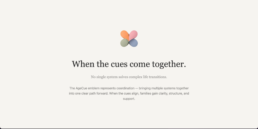
When the cues
come together.
No single system solves complex life transitions. The AgeCue emblem represents coordination — bringing multiple systems together into one clear path forward.
When the cues align, families gain clarity, structure, and support. The four-petal form echoes both connection and wholeness — each piece distinct, each piece necessary.
The Four Cues
Four dimensions
of support.
Each cue reflects a core dimension of care. Together they form the complete AgeCue system — the architecture of a fully supported life transition.
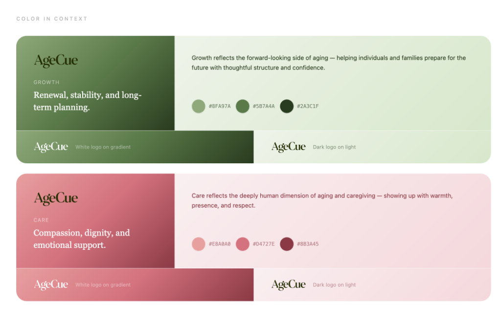
Renewal, stability, and long-term planning.
Growth reflects the forward-looking side of aging — helping individuals and families prepare for the future with thoughtful structure and confidence.
- Life transition planning
- Long-term care planning
- Financial coordination
- Future housing decisions

Mark System
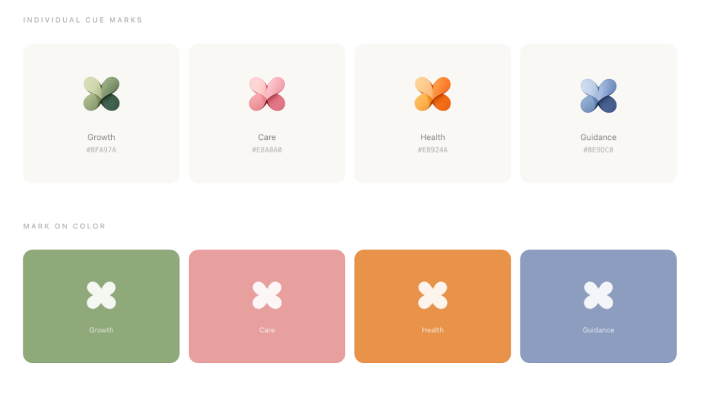
Individual cue marks.
Growth
#8FA97A

Care
#E8A0A0

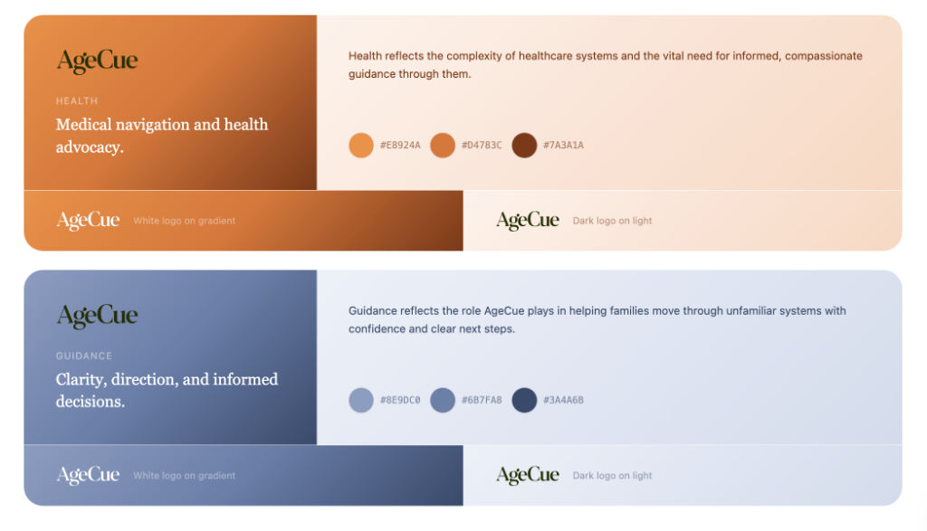
Health
#E8924A

Guidance
#8E9DC0

Growth
Care
Health
Guidance
Identity
The logotype system.


Logo with cue accent variants
 Growth Cue
 Care CueHealth Cue
 Guidance Cue
Color Architecture
A system built
from meaning.
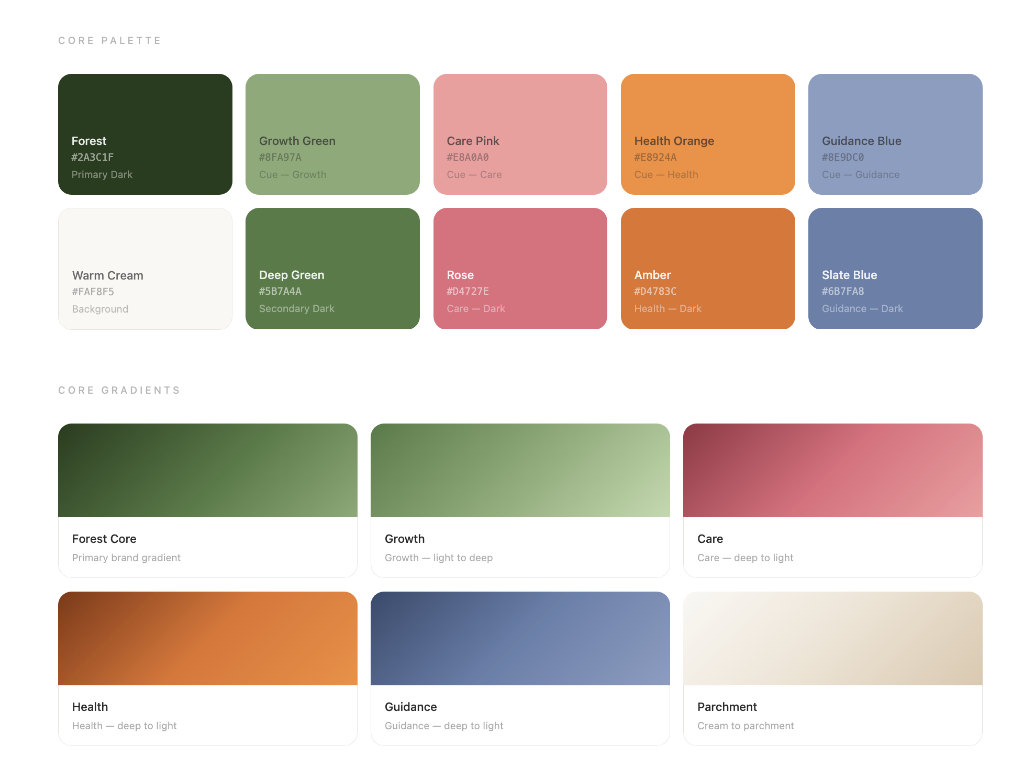
Forest
#2A3C1F
Primary Dark
Growth Green
#8FA97A
Cue — Growth
Care Pink
#E8A0A0
Cue — Care
Health Orange
#E8924A
Cue — Health
Guidance Blue
#8E9DC0
Cue — Guidance
Warm Cream
#FAF8F5
Background
Deep Green
#5B7A4A
Secondary Dark
Rose
#D4727E
Care — Dark
Amber
#D4783C
Health — Dark
Slate Blue
#6B7FA8
Guidance — Dark
Core gradients
Forest Core
Primary brand gradient
Growth
Growth — light to deep
Care
Care — deep to light
Health
Health — deep to light
Guidance
Guidance — deep to light
Parchment
Cream to parchment
Brand Values
What we stand for.
Clarity
We make complex situations understandable.
Dignity
Every person deserves respect, agency, and compassion.
Informed
Decisions are made with the right knowledge at the right time.
Grounded
Even in crisis, we bring calm structure and steady guidance.
Courageous
We help families face difficult moments with confidence.
Presentation Design
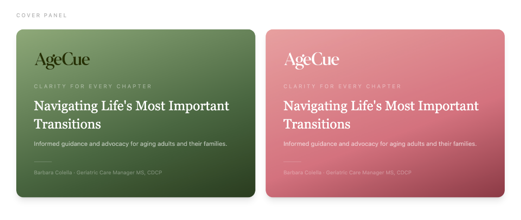
The deck in context.

Creative Direction
"The four petals aren't just shapes — they're a promise. That no matter where a family enters the system, they'll be held."
AgeCue needed a brand that could hold the weight of what families carry during life's hardest transitions — and still feel warm, clear, and human. The butterfly form emerged naturally: four systems, four cues, one cohesive movement forward.
— Aliyana Genée, Creative Director