
Brand Guide & Case Study
The design does as much work as the molecule.
A local peptide micro-lab designed through aesthetic psychology. Six protocols, one stack, and a delivery model shaped around trust, clarity, and the human body's natural rhythm.
MOLUCU™ — Peptide Protocols
01 — The Challenge
A world of complexity needed
a world of clarity.
Peptides and performance compounds are notoriously opaque. Users face too many choices, not enough guidance, low trust in online vendors, confusing science, poor UX across the industry, and no hyperlocal fulfillment.
Peptides are intimate — they enter the body, shape cellular behavior, shift energy and function. The process demanded its own emotional architecture, not a standard e-commerce frame.
The question became: How do you design a peptide experience that feels safe, intelligent, intuitive — and deeply human?
02 — The Insight
The body responds to environment
before instruction.
A peptide is an internal signal. A product page should feel like that signal. Instead of building a storefront, we built:
- 01Six emotional worlds
- 02Six color-coded protocols
- 03A sensory language for internal change
- 04A stack-builder that feels like composing a rhythm
- 05A delivery model that mirrors care, not commerce
MOLUCU was designed as a micro-lab, not a brand.
Local. Precise. Ritualized.
03 — The Solution
A full-stack peptide ecosystem
with a quiet-coded interface.
Layer 1
Client Experience
A calm, guided system for choosing and understanding a peptide stack.
Layer 2
Member Dashboard
A research hub, fulfillment center, and preference profile for ongoing protocols.
Layer 3
Admin Console
A clean, fast, minimal back-end for operators to manage stacks, deliveries, clients, and scheduling.
Each layer tells a different emotional story — but they share a single logic: reduce friction, invite clarity, and bring the user closer to their own instinct.
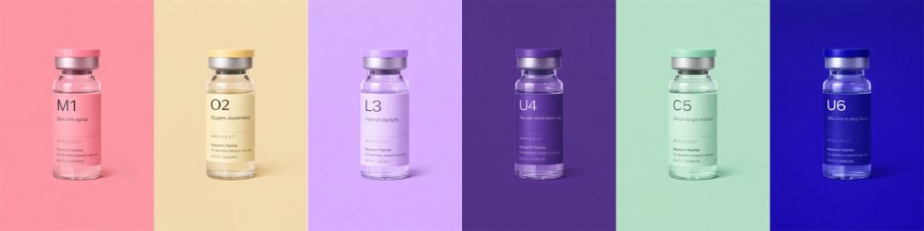
03.5 — Logo & Identity
Minimal. Timeless.
Unmistakably MOLUCU.
The logo is designed to work across surfaces and contexts. Clean letterforms. Quiet confidence. The gradient underline mirrors the six-protocol system — a subtle signal that this is about transformation.

Primary Logo — With Protocol Gradient
The Gradient Signal

The six-color gradient underline represents the protocol spectrum. It's a subliminal cue: this system is complete, interconnected, and designed for the full human experience.
Logo Variations


Light Backgrounds
Gray (#8A8580) on neutral, warm, or light surfaces. Maintains quiet authority without competing for attention.
Dark Backgrounds
White on deep tones, protocol colors, or brand photography. Provides clarity without harshness.
Usage Guidelines
Clear Space
Maintain minimum clear space equal to the height of the letter 'O' around the logo.
Minimum Size
Digital: 120px wide minimum. Print: 1.5 inches wide minimum for legibility.
Don't
Do not stretch, rotate, add effects, or alter colors. The logo is designed for clarity.
04 — Typography
Large, quiet, scientific.
The typography is intentionally wide, unrushed, minimal, and airy. This mirrors the experience we want the peptide to induce: clarity without anxiety. Text is part of the nervous system experience.
Inter
Primary TypefaceClean. Clinical. Geometric rationality with humanist warmth.
Light — 300
ABCDEFGHIJKLMNOPQRSTUVWXYZ
abcdefghijklmnopqrstuvwxyz
Regular — 400
ABCDEFGHIJKLMNOPQRSTUVWXYZ
abcdefghijklmnopqrstuvwxyz
Medium — 500
ABCDEFGHIJKLMNOPQRSTUVWXYZ
abcdefghijklmnopqrstuvwxyz
Numerals
0123456789
Protocol Headers — Display Scale
Type Scale
Start the signal.
Designed to be felt.
The body responds to environment.
A local peptide micro-lab designed through aesthetic psychology.
PROTOCOL NOTES · MEMBERS ONLY
05 — Color System
Color becomes part of
the medicine.
Each color is chosen for both scientific relevance and emotional resonance. These are not random lifestyle colors — they are somatic cues. The moment the user sees the color, their body gets the message.
Circulation · Warmth · Inner Ignition
#E8918A
Oxygen · Expansion · Breath
#E8D88E
Metabolism · Circadian Light · Regulation
#CDA8E0
Nervous System · Calm · Descent
#5B3A7A
Gut Clarity · Coolness · Renewal
#A8D8B8
Mystery · Night Cycle · Introspection
#2A3168
Protocol Spectrum
Supporting Neutrals
Synesthetic Design
The UI lets users feel the molecule's intention before reading a single word.
This creates synesthetic design: science → atmosphere → intuition.
05.5 — Peptide Categories
A six-color system organized by function and felt experience.
Each protocol lives inside a six-color system that organizes the peptides by their core function and emotional effect on the body. The palette was intentionally crafted to be intuitive, somatic, and quietly clinical — allowing clients to understand their stack at a glance.
Core Domain
Skin, Vitality, Inflammation Balance
Why Glow
Pink signals warmth, circulation, and visible radiance.
What it Represents
- Skin support + collagen pathways
- Subtle anti-inflammatory effects
- Cellular 'freshness'
- Aesthetic-forward outcomes
Core Domain
Metabolism, Oxygenation, Daily Performance
Why Energy
Yellow reflects alertness, metabolic fire, and natural momentum.
What it Represents
- ATP + energy production
- Endurance
- Metabolic support
- Cognitive clarity from better circulation
Core Domain
Regulation, Calm, Emotional Balance
Why Mood
Lavender represents the emotional middle ground where regulation happens.
What it Represents
- Mood support
- Stress buffering pathways
- Hormonal harmonization
- Emotional steadiness
Core Domain
Deep Recovery, Tissue Repair, Strength
Why Repair
Deep purple signals intensity: nighttime healing and cellular repair.
What it Represents
- Muscle + tissue repair
- Anti-inflammatory support
- Recovery from training or stress
- Nighttime healing aid
Core Domain
Immunity, Gut, Stability, Longevity
Why Core
Green represents immune clarity, gut alignment, and internal stability.
What it Represents
- Gut health + GI integrity
- Immune modulation
- Detox + internal clarity
- Longevity support
Core Domain
Rest, Nervous System, Circadian Rhythm
Why Sleep
Blue is the visual shorthand for calm, depth, and restorative rest.
What it Represents
- Sleep onset + quality
- Nervous system downshifting
- Circadian alignment
- Recovery from overstimulation
How the Category System Works Together
Each color is more than a label — it's a somatic cue. Clients can intuitively build a stack based on how they want to feel:
The system creates protocol literacy without overwhelming the user, which is the cornerstone of MOLUCU's quiet clinical positioning.
06 — Protocol Worlds
Each protocol opens into a soft,
atmospheric environment.
Merging clinical precision with emotional intelligence. Each world is full bleed color, beautifully sparse, anchored by a single sentence. A design representation of the molecule's felt experience.
Start the signal.
THE INITIATOR
Warmth. Activation. Internal ignition. Designed to wake the system from the inside out. Expect clarity. Expect warmth. Expect motion.
Oxygen, expanded.
THE FLOW PROTOCOL
Support for flow, breath, and cellular glide. Not just energy — ease. For those who hold tension or move too fast to feel it.
Internal daylight.
THE LIGHT LINE
Mood modulation. Circadian support. Feels like the morning you finally slept well. This isn't brightness — it's balance.
You can come down now.
THE UNWIND
Nervous system repair for the high-functioning frayed. This isn't sedation. It's recalibration. For calm without collapse.
Return to gut instinct.
THE CORE REPAIR
Connective tissue. Collagen. Gut lining. This one goes deep — where digestion meets intuition. Build from the base layer.
The unknown, optimized.
THE MASTER SWITCH
The complex one. Hormonal. Metabolic. Built for those who've tried everything — and want something coded for nuance. Proceed with intention.
07 — Interface Design
Atmospheric, not ecommerce.
We intentionally avoided product grids, crossed-out prices, walls of text, and anything that feels crowded. Each screen slows the user's heart rate — literally. The UI induces internal clarity before anything is taken.
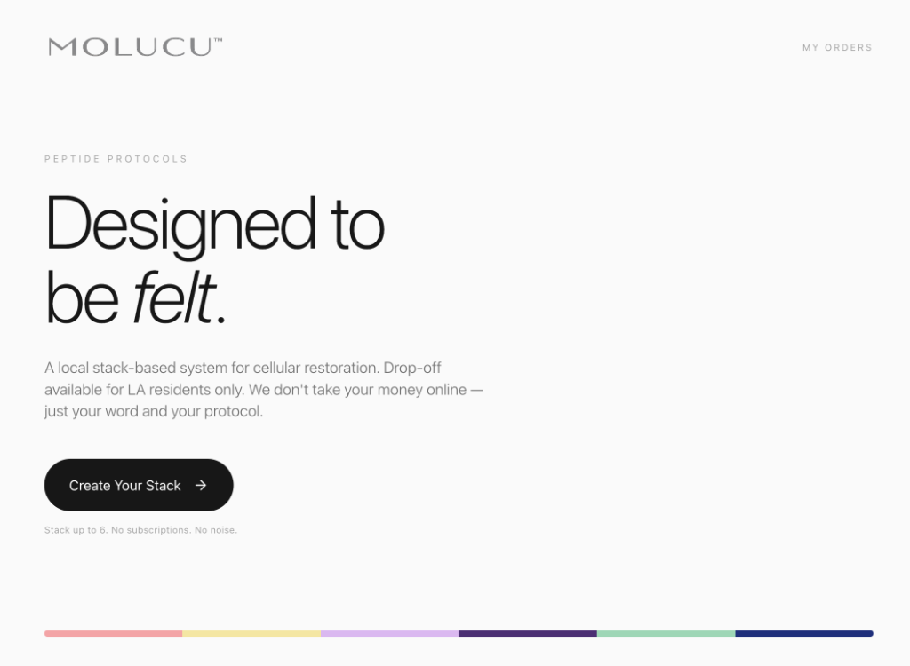
Landing Experience
Clean, minimal entry point with clear value proposition
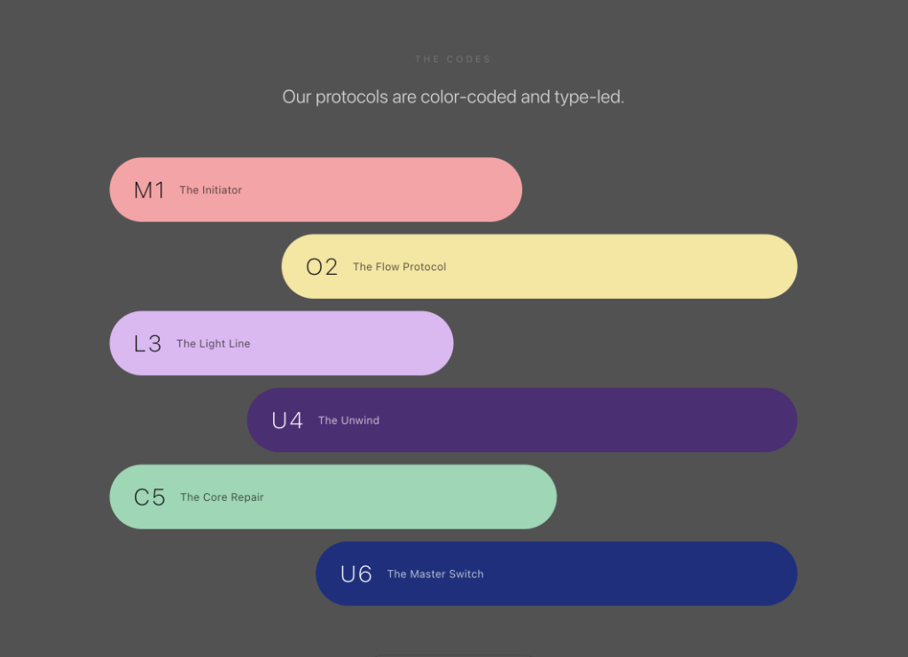
Protocol Codes
Visual hierarchy using color and typography to distinguish each protocol
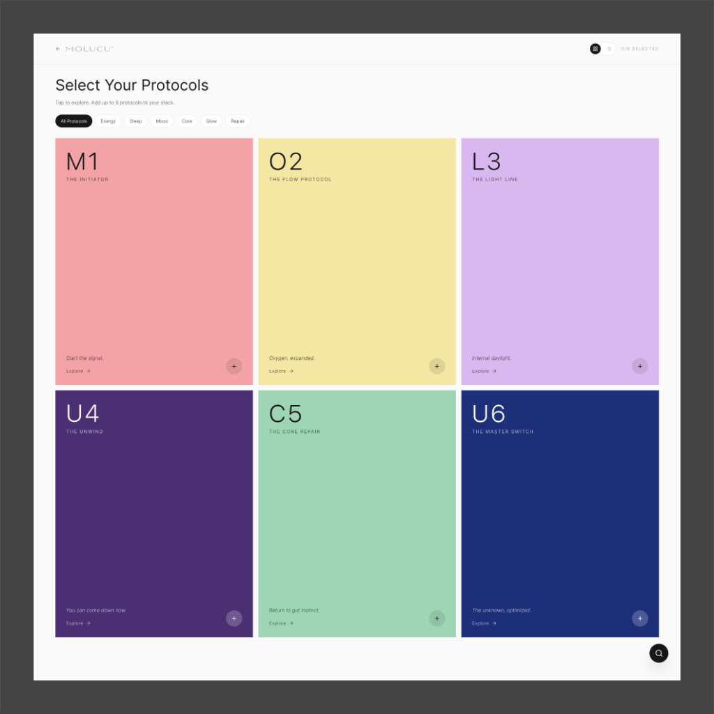
Select Your Protocols
A color-coded grid system for browsing and selecting peptide protocols
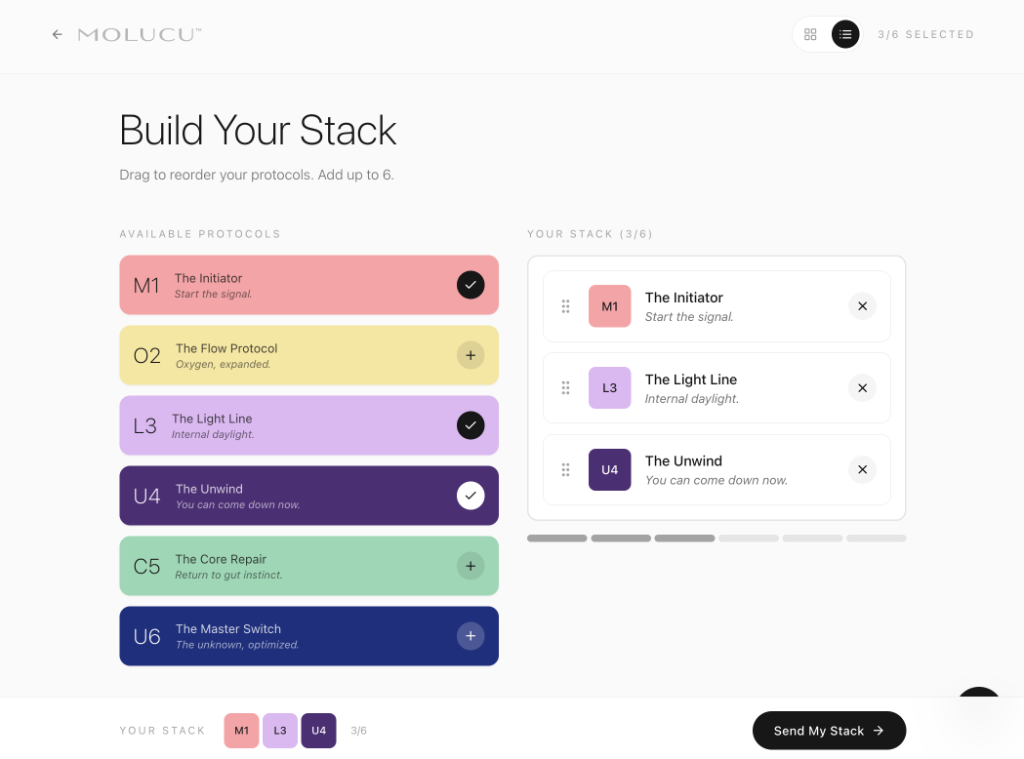
Build Your Stack
Intuitive drag-and-drop interface for composing a personalized protocol stack
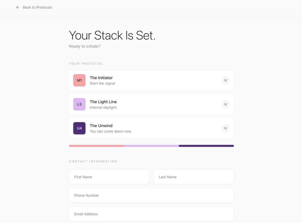
Confirmation
Review selected protocols before submission
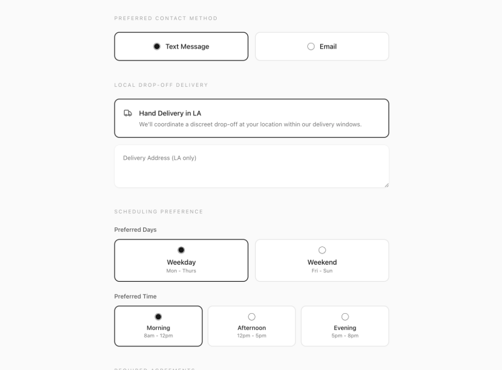
Delivery & Contact
Simple, trust-based form for drop-off delivery preferences
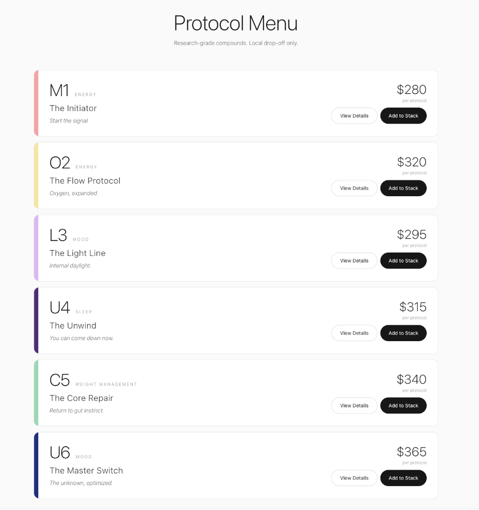
Protocol Menu
Detailed pricing and information for each protocol option
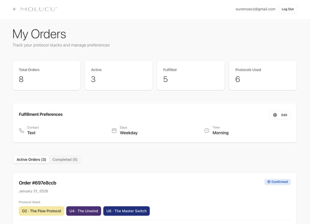
My Orders Dashboard
User hub for tracking stacks and managing fulfillment preferences
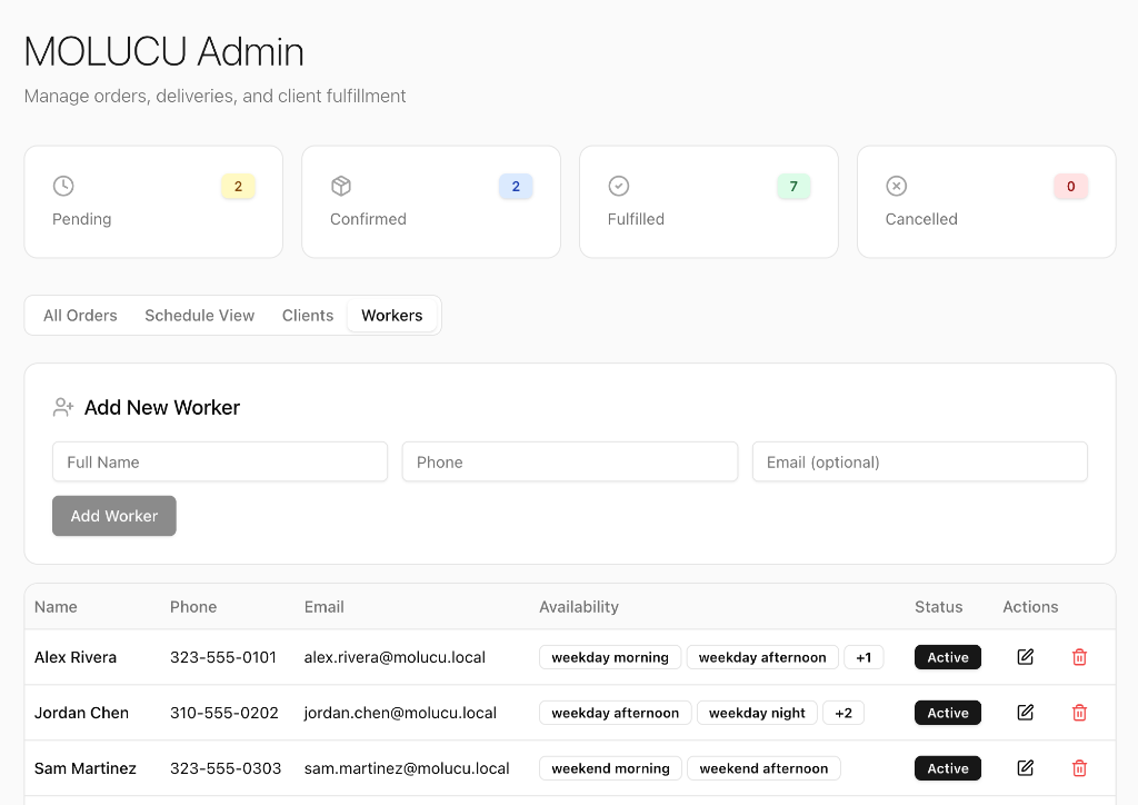
Admin — Workers Management
Manage delivery staff and their availability across time slots
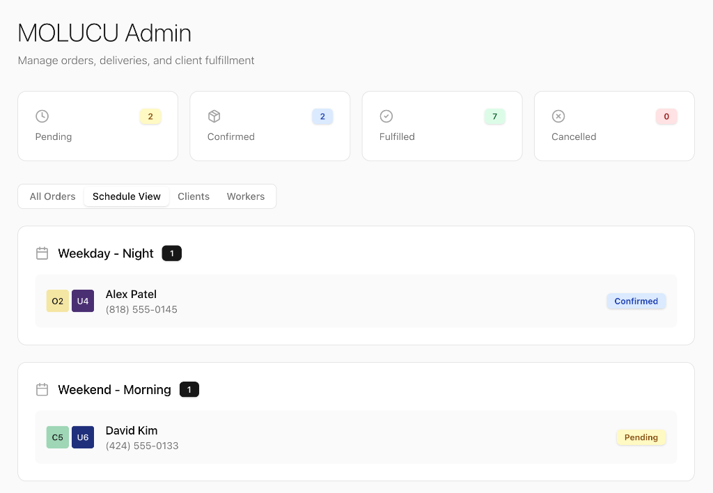
Admin — Schedule View
Visual scheduling interface for coordinating deliveries by time and worker
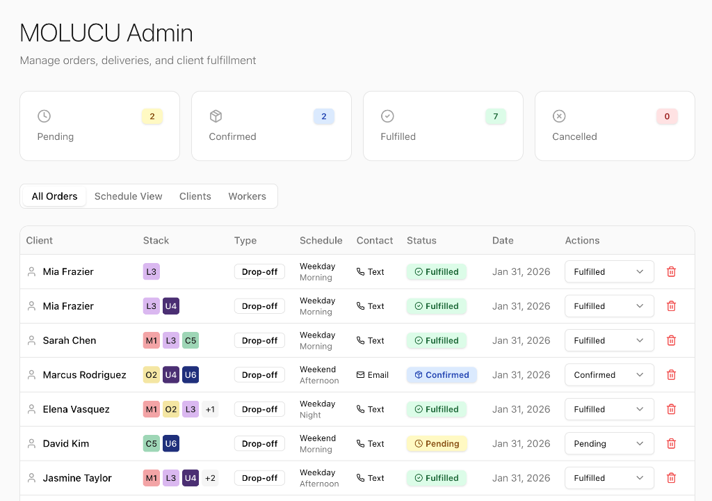
Admin — All Orders
Central hub for managing all client orders, stacks, and fulfillment status
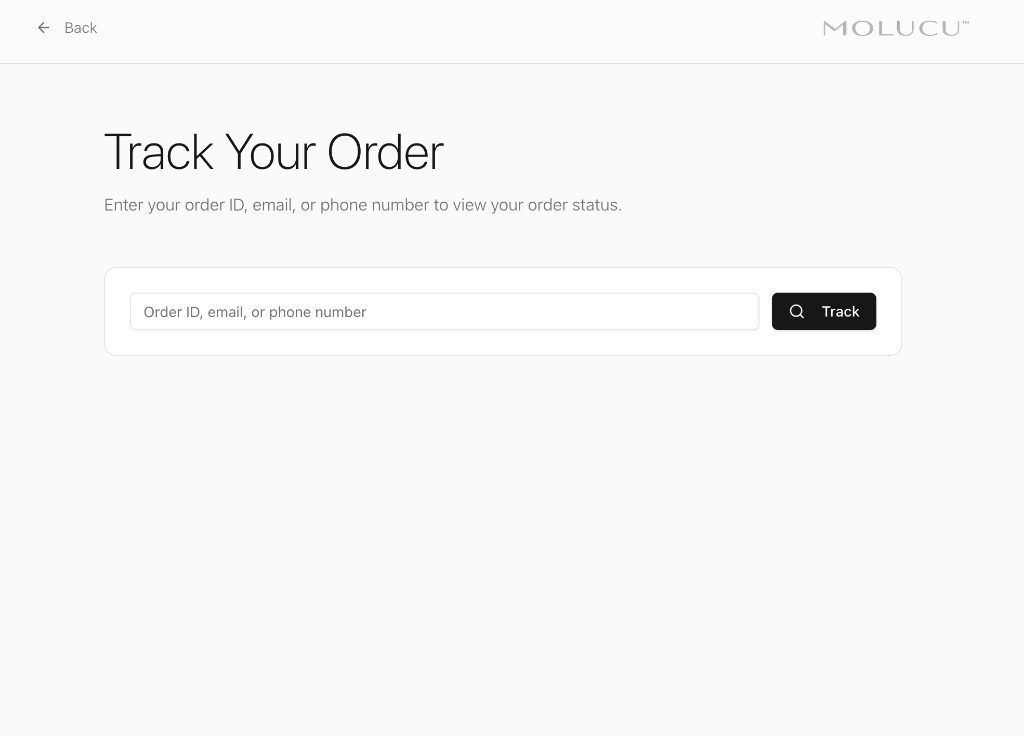
Order Tracking
Public-facing order lookup for clients to track their protocol deliveries
Aesthetic Psychology
Design is emotional architecture. Every choice shapes the internal weather of the audience.
08 — Design Principles
Designing for the body requires
designing for the psyche.
The body responds to color before language
Each protocol's color is chosen for its corresponding physiological and emotional resonance. Color becomes part of the medicine.
Text is part of the nervous system experience
Giant protocol headers establish hierarchy instantly, communicate identity without chemical names, and create clinical spaciousness.
A medical moment should not feel like shopping
Each protocol has a full-color field, a single anchoring sentence, space to breathe, and a slow guided scroll.
Brand language becomes regulation
Every line is short, somatic, and sensory. These aren't marketing lines — they are instructions to the nervous system.
The act of selecting becomes the ritual
The stack builder creates ownership — the stack feels personal, not prescribed. People don't need more shopping carts. They need systems.
Trust becomes part of the aesthetic
The drop-off-only model communicates safety, accountability, presence, and seriousness. Logistics can be brand identity.
09 — Operational Model
Hyperlocal. Human. Trust-based.
Safety
Relationship
Precision
Community
MOLUCU is a drop-off-only system: no shipping, no mass production, no anonymous purchases. Every order becomes part of a quiet loop of care.
10 — Outcomes
A micro-lab that feels
like a ritual.
Stack submissions increased after the launch of the builder
Users consistently selected 3–4 protocols (ideal range)
Feedback highlighted ease, calm, and clarity
Admin time for routing decreased due to clean scheduling UI
Clients expressed increased trust from drop-off model
The color-coded system reduced overwhelm dramatically
MOLUCU became not just a product — but a way of helping people feel more connected to their internal signals.
In a world where wellness is noisy,
MOLUCU is intentionally quiet.
Aesthetic psychology applied to health tech — creating an environment where the user's intuition becomes a valid data point.
MOLUCU™ · Brand Guide · 2026